Accountability matters: Inquiry into the country’s Covid-19 response called for, now in the Italian Parliament
A speech by parliamentarian Alice Buonguerrieri—her name meaning Good Warrior Stock (!) —demanding an inquiry into the whole of Italy’s Covid tyranny, as Former Prime Minister Giuseppe Conte and Former Minister of Health Roberto Speranza scuttle out of the chamber. (Alex Thomson)
Despite the effort to silence her by other MP’s, she completed her speech raising a long list of unanswered questions.
Will Italy or any other country ever get to the true answers holding those responsible accountable? It is a question that remains open for the time being, while governments and institutions are busy paving the way to enhanced control mechanisms.
Now is the time not to leave any stone unturned – all the evidence showing the irresponsible decisions that led to the suffering and harm of many needs to be revealed. The untruthful reporting, the censorship and all other misconduct breaking the rule of law and ethics need to be brought to light – in Italy and elsewhere.
Were the unprecedented excess deaths curves in Northern Italy in spring 2020 caused by the spread of a novel deadly virus?
A reassessment of the available evidence suggests another factor was involved.
WRITTEN BY Dr Jonathan Engler
I have learned so many new things during the past few years — one of the few, possibly the only, redeeming features of the “pandemic”.
These lessons span many disciplines: technology, immunology, virology, epidemiology, statistics, philosophy, political theory and public law to name but a few. However, one discipline which I never thought would be relevant to my digging into recent events was geography. This was a subject I detested at school, though in retrospect I am probably not alone in concluding that one’s penchant for any particular subject tended to stem from whether or not you liked the teacher, rather than any personal aptitude for it.
Anyway, it turns out that geography is now a lot more mathematical than it was when I was taught it over four decades ago. I have learned this from a rather lateral-thinking evolutionary biologist in PANDA who feeds me tidbits — with evidence — of what many regard as heretical thinking; however he doesn’t wish to be in the limelight himself. It was he who did the number-crunching on which this analysis of excess deaths in Lombardy is based.
Back to geography and its associated mathematics. Some of the questions people who study geography like to ask are these: to what extent and why are different places similar, or different? What process caused them to be so, and where and when might that process have started?
This has obvious application in analysing the purported spread of a novel deadly virus across the world from Wuhan, as authorities claimed happened in early 2020. As pointed out in several analyses (see, by way of example, these papers reporting data from Italy, the USA, Congo and Brazil), there is growing evidence of the totally unnoticed presence of the virus prior to the purported date of the start of the pandemic and even as early as September 2019. In nearly all papers reporting such data, the significance of there being no excess death observable until the emergency is declared seems to have been missed.
It is worth considering this counterfactual: imagine there was no virus at all, but that for some other reason (any will do) governments decided to institute a range of measures including:
- Telling people not to attend healthcare if they had a cough, fever or other symptoms both to “protect” healthcare and also because any contact with healthcare would quite likely make you contract a deadly disease.
- Telling healthcare staff to isolate if they (or in some cases someone in their household) received a positive test for a certain illness, even if asymptomatic.
- Emptying beds in preparation for being “overwhelmed”.
- Terrorizing and isolating elderly people especially those living in care homes, denying them visits from relatives and reducing or eliminating in-personal visits from health and social carers.
- Using the entire machinery of state plus all social media and legacy mainstream media channels to promote an exaggerated narrative of fear aimed at the public and spilling over into healthcare workers, when it is well established that stress has a number of adverse health effects, including immuno-suppression.
- Massive overuse of a treatment (ventilation) with no solid evidential basis, now known to be extremely harmful.
The implementation of such policies would result in protests in the streets with people declaring that “thousands of people will surely die”, and no doubt they would have been right. It is inconceivable that such policies would not have a significant associated mortality. Recall how a former UK Health Minister, Jeremy Hunt, was vexed by the fact that the (comparatively milder) NHS staffing deficiencies at the weekend measurably increased the risks to patients unfortunate enough to not fall ill during the working week.
It must therefore surely be reasonable to assume that at least some of the deaths which occurred in the aftermath of the cataclysmic changes to the delivery of healthcare — especially of the frail and elderly — might have been caused by policy, rather than virus. The question is: what proportion were caused by such policy changes, and what by the spread of a virus through the population?
The starting point in analysing this question is to ask: what is the evidence of spread of a virus being the cause of the excess death curves observed? Is “spread” able to be measured, and what would be the implications of different findings?
Imagine a forest fire starting in one corner of a dry forest, ignited perhaps by someone leaving a smouldering barbeque lying around. It would start with a single localized cluster of burning, which would then grow and spread in tendrils until a patch of some more dry tinder was found; these areas would then catch fire, perhaps igniting nearby areas by direct contact. Occasionally a spark would fly off or a burning dead branch would fall off a tree, igniting an area slightly further away, and the process would carry on there. After a while, the whole forest would be ablaze, but only for a short time, because it would soon burn itself out, but with various areas going out at different times because the fires did not start in those areas at the same times.
That would be what you’d expect to see when a process spreads from a point source. What you would NOT expect to see would be the entire forest catching fire at the same time and all areas burning themselves out simultaneously. If that happened, most people would assume that something which affected the entire area at the same time — and which did not rely on spread at all — had happened, maybe a huge destructive fireball from a nearby explosion.
One key point in relation to this is that surveying the scene after the event does not really help that much in determining the cause. They look similar in both scenarios — a burnt out forest. You need to look at a time series, ie. how the different areas were affected over time, to find the conclusive evidence of spread.
Take a look again at the all-cause death curves in the 13 administrative areas (hereafter termed “provinces” or “administrative areas”) forming the region of Lombardy.
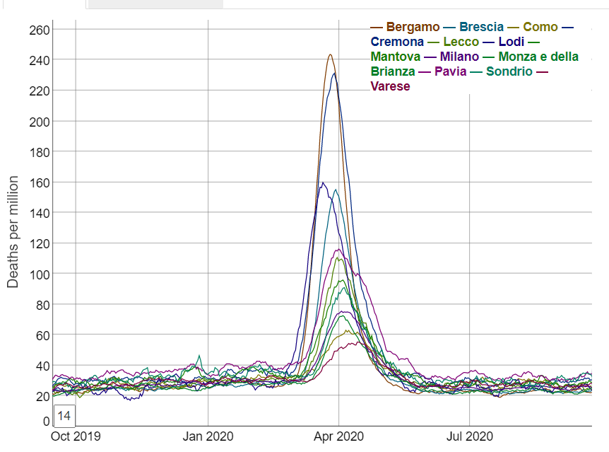
These are not what you would expect at all from spread. From simple observation this suggests a near-simultaneous non-spatially dependent process has operated on the region of Lombardy. Close analysis reveals that the excess death curves for Lodi appear to start around 23 Feb and for all the other areas this happens on or within just a few days of 1 March.
But can this be demonstrated more mathematically?
It turns out that the answer to this is yes — using the measurement of auto-correlation. This is essentially a statistical analysis of the characteristics of neighbouring areas which generates several statistics (the best known of which is “Moran’s I”) which indicate to what extent those characteristics are spatially dependent — i.e. how closely does its value in one area rely on its value in a neighbouring area.
The characteristic we are looking at here is excess death. It is axiomatic that a lethal virus spreading through a population will cause excess deaths if its harm is being added to the usual vicissitudes of life (and death), hence this is an appropriate measure — and a much better one than counting deaths labeled as “covid deaths”, as it removes the variability introduced by differences in testing policies, unreliable tests, and cause of death decisions by doctors.
As pointed out in the Lombardy analysis, we are fortunate that extremely fine-grained daily deaths data is available for Italy; in fact, this is probably the most granular data available anywhere in the world, showing daily deaths occurring in relatively small areas across Italy.
So, what does this more fine-grained analysis show?
Below depicts the numbers of people dying from all causes across Northern Italy (which includes Lombardy) in February.
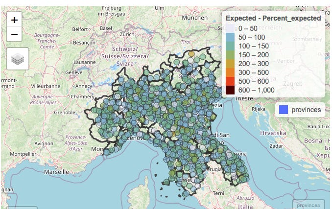
The numbers of deaths in each municipality with a population large enough to provide meaningful data (of which there are several hundred in Northern Italy) have been colour-coded according to the numbers of deaths in the month of February compared to the average number observed over the previous 5 years.
The notable observation is that as would be expected in the absence of a pandemic, some areas have deaths a little below “expected” (light blue or grey), some a little above (green or yellow). But the key point is that there are no clusters at all.
There is the occasional area where deaths are more than doubled, but it should be noted that some of these areas are small and actually usually have just one or two deaths in a month so an extra death or two would represent a doubling.
Both the lack of excess deaths overall and the lack of clusters of excess deaths are in fact totally unexpected in light of the evidence — now supported by papers studying antibodies and PCR testing data AND symptoms — of significant presence of Sars-Cov-2 in February (and earlier, in fact).
This graphic, reproduced from The early phase of the COVID-19 epidemic in Lombardy, Italy, Careda et al, shows the estimated reproduction rate derived from symptomatic cases in the various administrative areas of Lombardy.
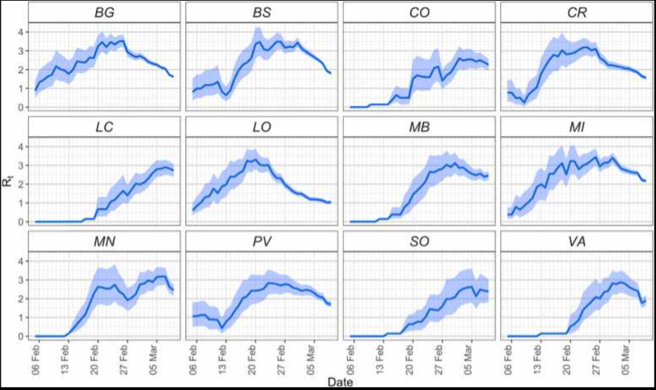
How could an apparently highly contagious and lethal virus have spread throughout the region so much that case growth was apparently actually slowing in most areas by the end of February, without leaving any signal of increased deaths in its wake?
It is worth appreciating that Northern Italy forms a “small world” in the sense that all the towns are well connected with each other. Nevertheless the towns themselves are each very compact. So most contacts between people will be within their own town in which they live, work and socialise. So the expectation — based on earlier emergence of a pathogenic virus capable of causing notable excess mortality — would be for a few of the seeded outbreaks to take off first leading to alarm bells being set off in these towns. Like the fire in the forest.
There would also be a high probability of spread to neighbouring towns/municipalities — again, just like the forest fire; it should be recognised that most contact which might result in viral transmission comes from short distance travel, with longer-distance travel representing some — but less spread.
However, in February there is no visible pattern suggestive of any clustering, and an arithmetic calculation of the degree of auto-correlation (which can be provided to any interested parties) confirms this.
So how about March — the month of the shocking excess death curves?
Here’s the map for March:
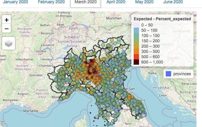
At first glance, there is visible clustering, so you would be forgiven for thinking that this represents evidence of viral spread. A statistical analysis for auto-correlation also suggests spread.
However, it is important to realise that auto-correlation can have causes other than biological spread. Each municipality is located within an individual province; differences between these provinces in the administration of health and social care which impacted on death rates would also result in the appearance of clustering. However, this is not due to the spread of a virus but rather due to the similarities between neighbouring municipalities in healthcare policy due to being in the same administrative area.
By fitting a model with 2 components — firstly the administrative province in which the municipality is located, and secondly the death rates in neighbouring municipalities — the effects of province and neighbouring municipality can be analysed separately.
This is what the picture in March looks like when the effect of provincial location has been subtracted mathematically:
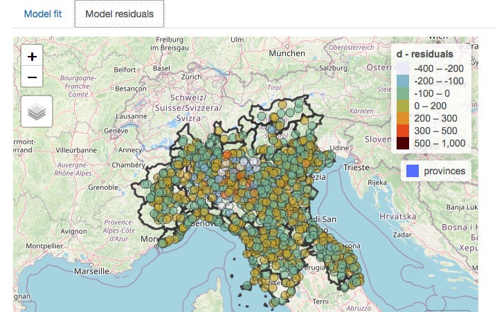
The clustering nearly entirely disappears when provincial borders are taken into account (and the statistical analysis confirms this), meaning that which one of the 13 provinces a person lived in was a much better predictor of death than whether there was a high rate of deaths in neighbouring municipalities.
On the assumption that healthcare is organised by province, the conclusion can only be that it was the manner in which healthcare was delivered which was relevant to the death rate, not the spread of a virus, which would of course have no respect for provincial boundaries.
The above discussion covers the period when death rates were climbing. However, there is further supportive evidence to be gleaned from the manner in which excess death rates later declined.
Recall that above I suggested that as the fire in the forest burned out, clusters would die out over a period of time as they started at different times. You would not expect all the fires to go out across the forest at the same time.
Yet the fires did all go out more or less simultaneously in Lombardy. There is a collapse in both excess deaths and any spatial pattern in May.

(An analysis for April — not shown here — is similar to March in that any auto-correlation was weak, and nearly entirely accounted for by provincial location.)
It is worth pointing out, as Michael Senger did in his recent piece, that the proponents of the narrative that “a novel deadly virus spread from Wuhan seafood market starting in Dec 2019” actually themselves rely on spatial analysis and case clustering centred on the market to make their case.
The below are extracted from their paper published in July 2022.

Of course, the emerging evidence of widespread prior spread embarrassingly demolishes this case in the same way as it raises crucial questions about what happened in Northern Italy.
Conclusion and closing remarks
Statistical analysis of auto-correlation of excess deaths in Lombardy in spring 2020 reveals much less clustering than would be expected if a virus spreading across the region was responsible. What small amount of clustering is observed appears to be more related to differences between the administrative regions in which the municipalities are located.
These observations surely raise questions which need answering around the causes of the high rates of excess deaths in the Lombardy region in spring 2020.
The fact that assumptions derived from the data from Lombardy — including estimates of the case and infection fatality rates — formed the basis of policies implemented first in the UK, and thereafter rippling across the world, makes this a question which should be addressed with some urgency.
This is especially the case since these policies are now being recognised as having caused catastrophic long-lasting harm to much of the world’s population with little or no discernible benefit.
A summary of the current state of the evidence for 2019 spread of Sars-Cov-2 was recently published in the BMJ by a group of Italian scientists, including an analysis of why the subject has not received the attention it deserves. This contained little discussion about the implications of its findings, the authors concluding however as follows (emphasis added):
Despite the technical limitations of available early origin studies, even a remote possibility that positive tests indicate an early SARS-CoV-2 circulation should be considered sufficient to warrant the scaling up of research to more samples from more regions and through a wider timespan. Time is running out: valuable samples that may contain the key to the understanding of SARS-CoV-2 origin might already have been destroyed as their regulatory storage time requirements lapse. Many more will meet the same fate in the coming months and years. What is there to lose in accepting this hypothesis as tenable and exploring it urgently before the chances of finding the answers to explain how this pandemic emerged are gone forever?
…Let us not waste our time in idle discourse! Let us do something, while we have the chance…at this place, at this moment of time, all mankind is us, whether we like it or not. Let us make the most of it before it is too late! – Waiting for Godot, Samuel Beckett.
We would concur, whilst also suggesting that the reason for the reluctance to discuss the matter of 2019 spread is surely to be found in the answer to the question marked in bold in the above.
What there is to lose — at least for those who have relentlessly pushed a single narrative explanation for all observations since 2020, censoring any alternative viewpoints with the use of the oxymoron “the science is settled” — is the realisation by citizens that a large proportion of deaths may have been wrongly ascribed to a virus rather than to their true cause — the nature of the response to the perceived threat of a virus.
We are very happy to share the source data files, explain how they have been transformed from those downloaded for the Italian Statistical Authority, and describe our methodology in creating the graphs above and measuring the auto-correlation. We invite any scientists, especially in Italy, to verify our analysis.
One specific area around which we would be grateful for further information is the nature and timings of differences between the various Lombardy administrative regions in the delivery of health and social care. We have assumed in the above that there were differences between regions in this respect but further details would be valuable.
The report was originally published September 2022 on PANDA Uncut Substack
Suggest a correction


![A Call to Europe: The Future of Our Children is at Stake – Historical Press Conf. in Brussels Jan 23 [12 Videos with Subtitles]](https://childrenshealthdefense.eu/wp-content/uploads/2022/01/chdeu-brussels-768x400.jpg)

